Margaret Calvert: Woman at Work
Wayfinding
This exhibition of the graphic designer Margaret Calvert at the Design Museum in London shows how design makes the built environment and transport infrastructure work for us. Simplicity is key to the signage for our motorways, roads, railway stations, airports and hospitals. We may not notice them, or be aware of their relevance, so subtle and subliminal are their presence. But they are of huge importance to the flow of traffic and guiding people through spaces – what Calvert and her colleagues call ‘wayfinding‘. An unspoken language of signs and symbols has been created to guide us on our way.
New Signs for the M1
The exhibition begins with the opening of Britain’s first full-length motorway, the M1, in 1959. This was a landmark in road construction, engineering and subsequent design of motor vehicles and service stations. The impact on road side repair and rescue services by the AA and RAC is well documented. But the motorway also required new signage to indicate that it was a motorway and how it should be used – to ‘wayfind’ the driver.
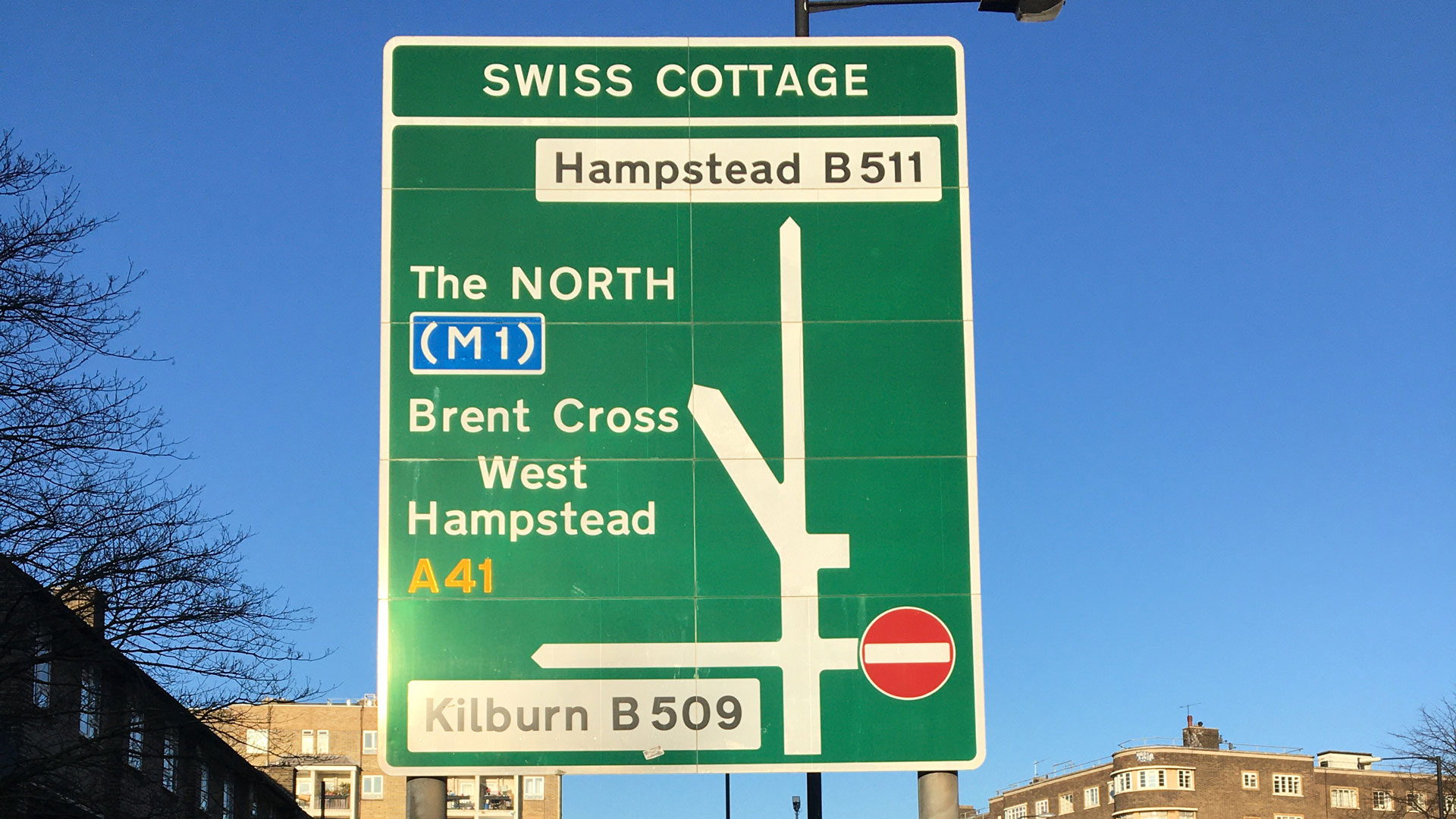
Simplicity was Vital
Signage had to be clear and unambiguous, while like the motorway itself, also about modernity and the future. The Ministry of Transport, aware that the new motorway would need a new ‘livery’, commissioned the graphic designer Jock Kinneir and the recently qualified Margaret Calvert to replace the existing haphazard and misleading road signs with a new design system. Colour, fonts, size of lettering and symbols had to be obvious, legible and clear. Readability of lettering at a distance had to be three times larger than existing signage given faster speeds on the motorways. Information needed to be registered within a split second, with no time to ponder. Simplicity of the actual lettering was vital and a sans serif Transport Font was devised after much research.
Innovative use of Colour
Kinneir and Calvert were innovative in the use of colour. Until then road signs had tended to be black lettering of various sizes with serif fonts on a white back ground. The M1 required its own identity. So . . .
- Motorways were denoted with a blue background and white lettering
- A roads a green background, yellow for the road number and white lettering for the destination
- B and local roads with black lettering on white.
This innovative use of colour gave a uniformity across the country.


Pictograms
Calvert designed pictograms for road signs – no entry, one way, people crossing, and endless hazard signs – that were all researched to make them as simple as possible but at the same time legible for what they had to convey. The red outline is now automatically a hazard.
Photographs and film footage show how all the signage was road tested by the Road Research Laboratory on a runway at RAF Benson in the late 1950s. Signage was set at various distances and technicians marked them up to see if they were visible and understood.


Visual Identities
In the 1970s Calvert and Kinneir were commissioned to devise a visual identity for the French new town, St-Quentin-en-Yvelines. Calvert designed a slab serif font, which was not used here but taken up by the Tyne and Wear Metro. Named Calvert after its designer, this font is still in use in the Newcastle / Tyne and Wear transport network. There then followed fonts for British Railways – Rail Alphabet and more recently for Network Rail – Rail Alphabet 2.
Standing by a motorway sign in the exhibition, rather than viewing it at speed from the driving seat, reveals just how big it is. It perfectly shows the ways in which a designer is integral to the whole development and engineering team plus illustrates the detailed research involved, not just in graphics but also in the wayfinding. For Calvert this is especially so in her designs for the Newcastle Metro and Network Rail. The confines of a railway station concourse, with hundreds of mingling passengers wanting to get to different places, prove to be complex in design and psychological problems. Placing signage at the right height, with imagery suitable for a crowd not all speaking the same language, highlights the importance of imparting clear information through words and symbols.
In many ways Calvert’s pictograms look like precursors to emojis. Symbols for a taxi, bus and ticket machine have become universal across the world and probably emanated from Calvert’s studio. Over time signs need to be updated and Calvert’s pictograms continue to evolve as the actual object changes and new ones arrive – a 1960s black London taxi has had numerous incarnations and a vape pipe is a new addition.
The exhibition includes documents and photographs, film footage of the research stages and signage in prototype development. There are numerous manuals for the various corporate companies on the rules of how and where to place the signage; point size; weight of font; when to italicise; appropriate colours; and how to place a pictogram, all to enforce a common identity across a network.
Kinnear died in 1994, and now in her mid 80s Calvert continues to design, collaborating with other designers including Henrik Kubel. She still hand draws everything and these collaborations have brought her work into the digital arena. A variation of the Transport font was designed for the UK government in 2012 and is the face of .gov.uk websites.
Good design is Unobtrusive
As well as being a fascinating introduction to Margaret Calvert and to the study of typography and symbols, the exhibition also highlights the relevance of design and simplicity, that form and function – the mantra of industrial designers – really does work. Although he is not mentioned, this was well understood by Frank Pick decades before and his ‘fitness for purpose’ contribution to engineering, architecture and design at London Transport. Dieter Rams, designer of Braun appliances, has written that ‘Good design is unobtrusive. Products fulfilling a purpose are like tools. . . their design should be both neutral and restrained’. This simplicity of form with maximum functionality is exactly what Margaret Calvert achieves. Anyone involved in labelling and signage of an exhibition, collection or historic site can learn much from Calvert – simplicity being the key.
Deborah Jaffé
Are you a member of the Newcomen Society?
Having just celebrated its Centenary Year, the society has published over a 1000 papers in The Journal – an invaluable archive of original research material published twice a year, covering all aspects of engineering from ancient times to the present, plus available to browse and download in our FREE TO MEMBERS Archive.
Full Membership includes:
- Journal for the History of Engineering & Technology (two issues, one volume per year)
- Printed and/or PDF versions of LINKS, Newcomens’ newsletter (published 3 times a year)
- Free access and download facilities to the Society’s Archive of past papers back to 1920 (The Journal)
- Membership of local branches and subject groups
- Access to the website’s Member Area offering access to research sources & access to other members (subject to privacy permissions)
- Attendance at summer meetings, conferences, lectures and study days.
About the Author: Deborah Jaffé
Deborah graduated with an MA from the Royal College of Art after study at the London College of Furniture and Dartington College of Arts. She is the author of 8 books including: (Queen) Victoria (Carlton 2001); Ingenious Women (Sutton 2003); and The History of Toys (Sutton 2006). She is also co-editor, with Dr Stephen Wilson, of Memories of the Future (Peter Lang 2017).
A long standing interest of her’s is the relationship between industrial design and engineering, which became a focus when researching for Ingenious Women and The History of Toys. It’s also proved to be invaluable in Deborah’s current work as the editor of Newcomen Links.
She was a member of the V&A Trustees’ Committee of the Museum of Childhood; and served on the committee of the Centre for Cultural Memory at the IMLR, University of London. The variety of her work leads to lecturing to a diverse range of audiences on: women and innovation, Frank Hornby and Meccano, design in the Cold War and archives of memory included at: Newcastle University Business School; the Institute of Patent Agents; the Centre for Cultural Memory; the Wiener Library; the Newcomen Society and at the British Embassy in Berlin for the launch of Geniale Frauen (the German edition of Ingenious Women).